

Client
- Muse Group Asia Sdn Bhd
Services
-
Logo Design
-
Presentation Deck Design
Deliverables
- Logo
- Presentation Deck Template


Back to Portfolio
Project Info
Introduction
Muse Group Asia is creative marketing agency specializing in Sports & Entertainment with offices in Singapore, Bangkok and Kuala Lumpur.
They conceptualise, create and execute effective marketing strategy for clients – which includes commercial brand, media partners, government agencies and rights holders.
Challenge
Muse Group Asia was looking to conceptualise and propose a charity run event where proceeds will be donated to organisations who are pursuing environmental and sustainability efforts. They are looking for a designer that can execute the branding concept they have created.
Solution
I was tasked to create a logo, as well as produce a template for their pitch deck.
My role:
- Logo Design
- Presentation Deck Design

At a glance
GREAT GREEN RUN 2024
I will be showcasing the logo design and presentation deck I did for Muse Group Asia.
Highlights
Logo Concepts and Ideas
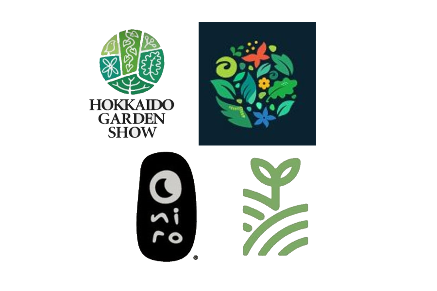
Thanks to client’s preparatory work, the design concept and ideas for this particular event had plenty of reference material. The key words would be “sustainability” and “environment”. Of course, the event title itself made the primary colour of choice obvious.
Below is the finalised logo, as well as some explanation as to how it was derived:
The Pitch Deck
Once the logo was done, it was time to create the pitch deck template.
The deck colours was derived from finalised logo, with green being the main colour, while other colours in the logo being used to highlight and accentuate the content elements.
The submitted template consists of nine different designs.
The Work
Branding & Design
- Adobe Photoshop
- Adobe Illustrator


Get in Touch
Find Out More
If you like to get more details on this particular project, or any other queries about my design works, feel free to drop me a message via the form.